 |
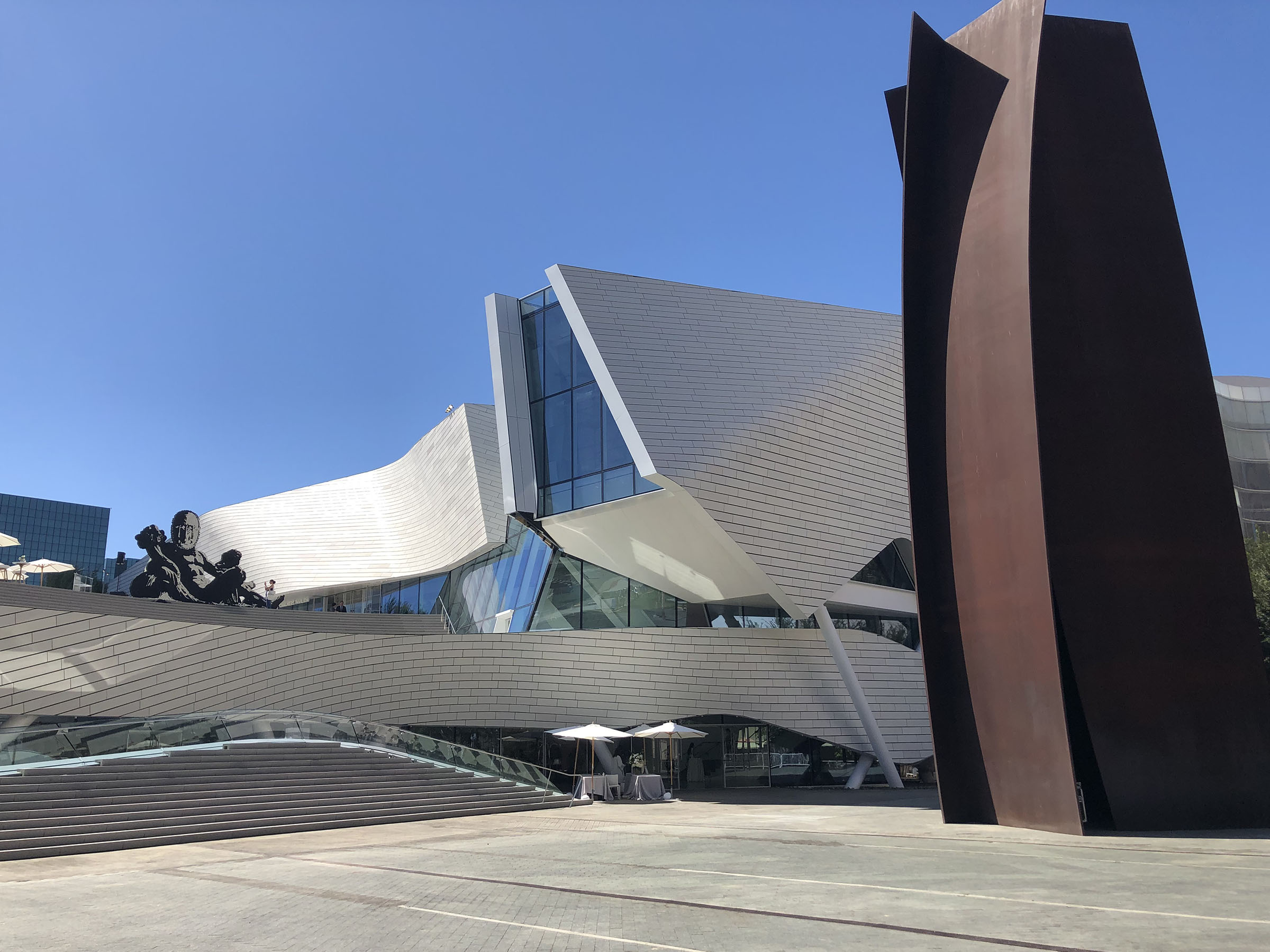
| Orange County Museum of Art, Morphosis Architects. At right is Richard Serra's Connector (2006), and at left is Sanford Biggers' Of many waters… (2022) |
The Orange County Museum of Art will open in its new Thom Mayne/Morphosis building on Oct. 8. Here are a few quick takes from the media preview.
As expected, it's a big upgrade for OCMA. It becomes Morphosis Studio's first completed art museum project. The building is 53,000 sf, with nearly 25,000 sf of exhibition space. That's about double the space in the last permanent site, in Newport Beach. The facade is clad in textured white terracotta tiles.
 |
Walkways from below
|
Suburban museums are often dependent on street banners to remind audiences that they exist. The new OCMA site is closer to Orange County's center of gravity (and the 405 freeway). As part of Costa Mesa's Segerstrom Center for the Arts, it has the opportunity to attract crossover cultural audiences. Fortuitously, the pre-existing Richard Serra sculpture, Connector, lands on the new museum's doorstep.
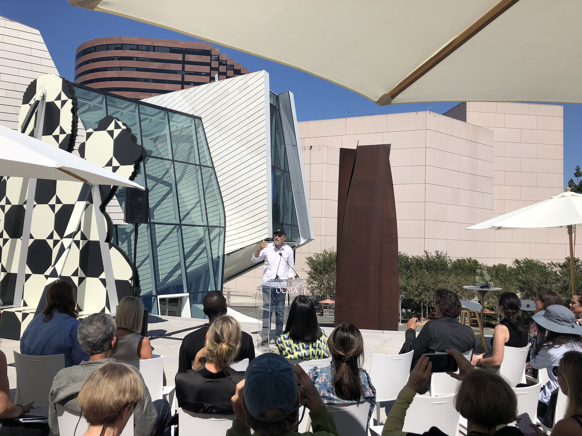 |
| Architect Thom Mayne speaking at OCMA media preview |
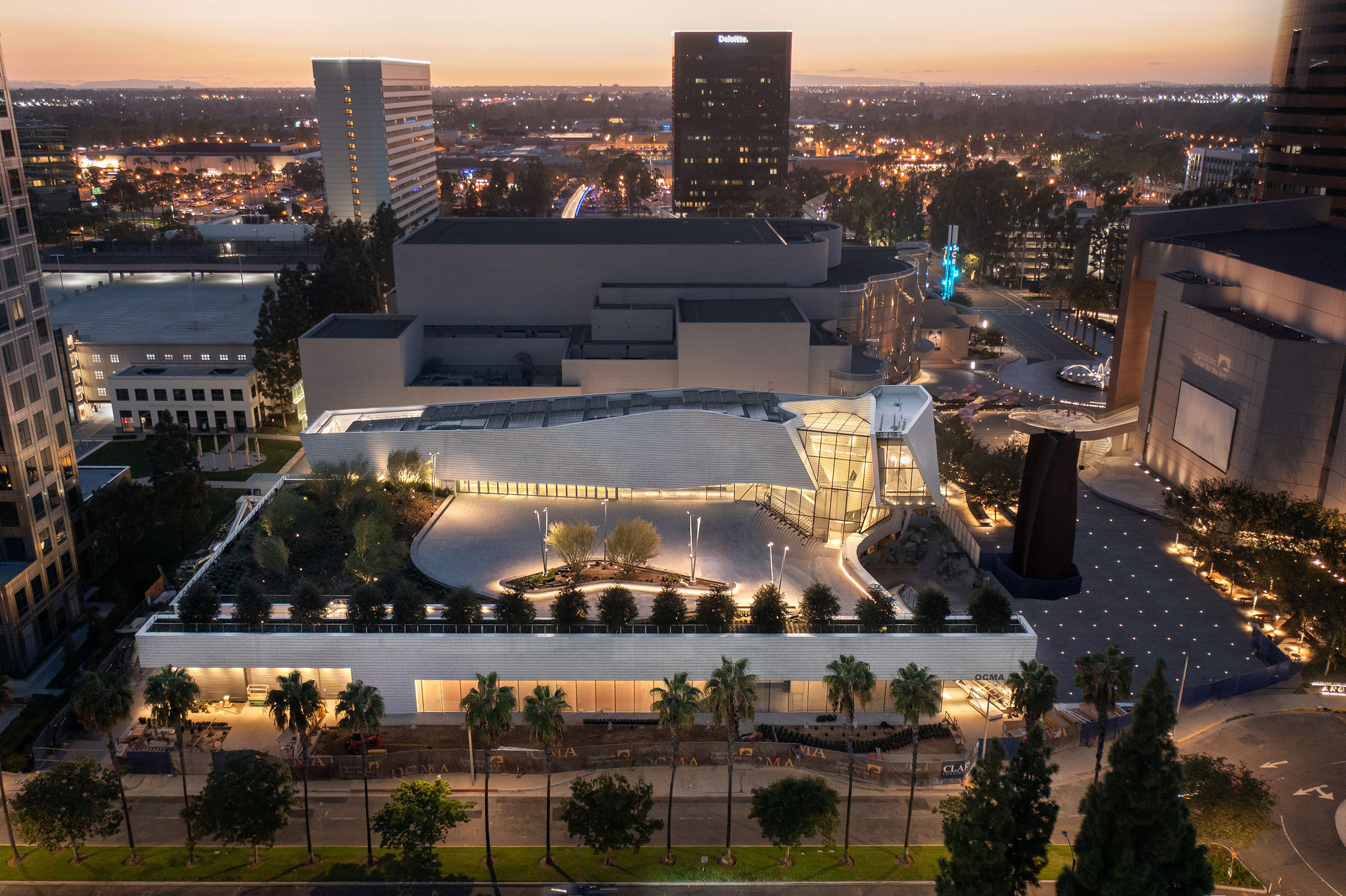 |
| Handout glamor shot of the building. Photo (c) Mike Kelley |
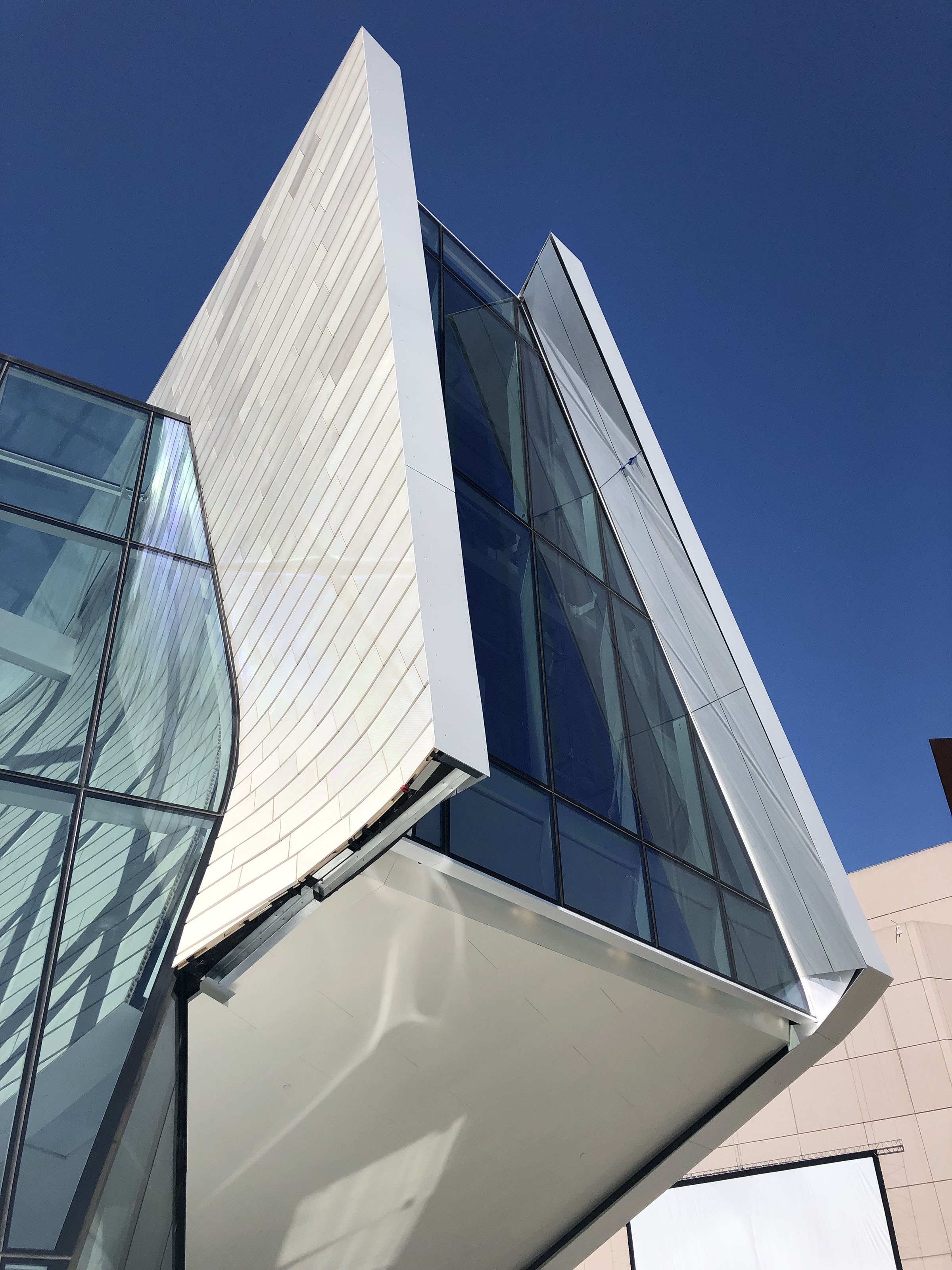 |
| Education wing |
I like the dematerialized exit signs. They are one of many grace notes.
 |
| First-floor galleries ("13 Women") |
The main suite of galleries has ceiling louvers for filtered natural light.
 |
| Staircase |
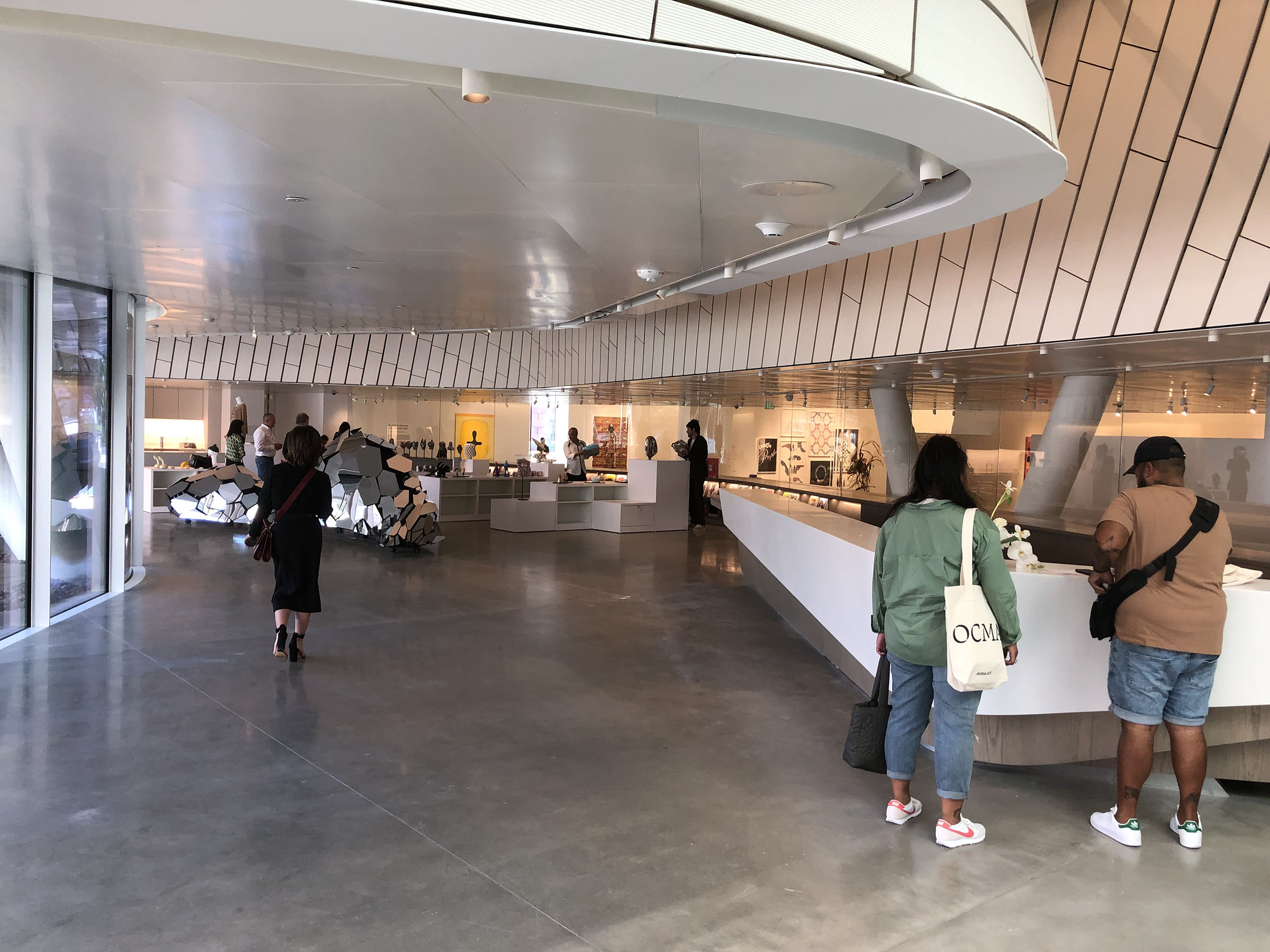 |
| Entrance desk and gift shop |
The gift shop has views into the galleries and the outdoors. A mirror-finish stainless steel display case with "hypnotic soundtrack" is by artist Sébastien Léon.
The first floor houses the entrance lobby, "California Biennial 2022: Pacific Gold," and a permanent collection display, "13 Women."
 |
| Hector Dionicio Mendoza, Coyota, 2020 |
From the biennial is Hector Dionicio Mendoza' Coyota. There's an indigenous/colonialism theme to several artists' work.
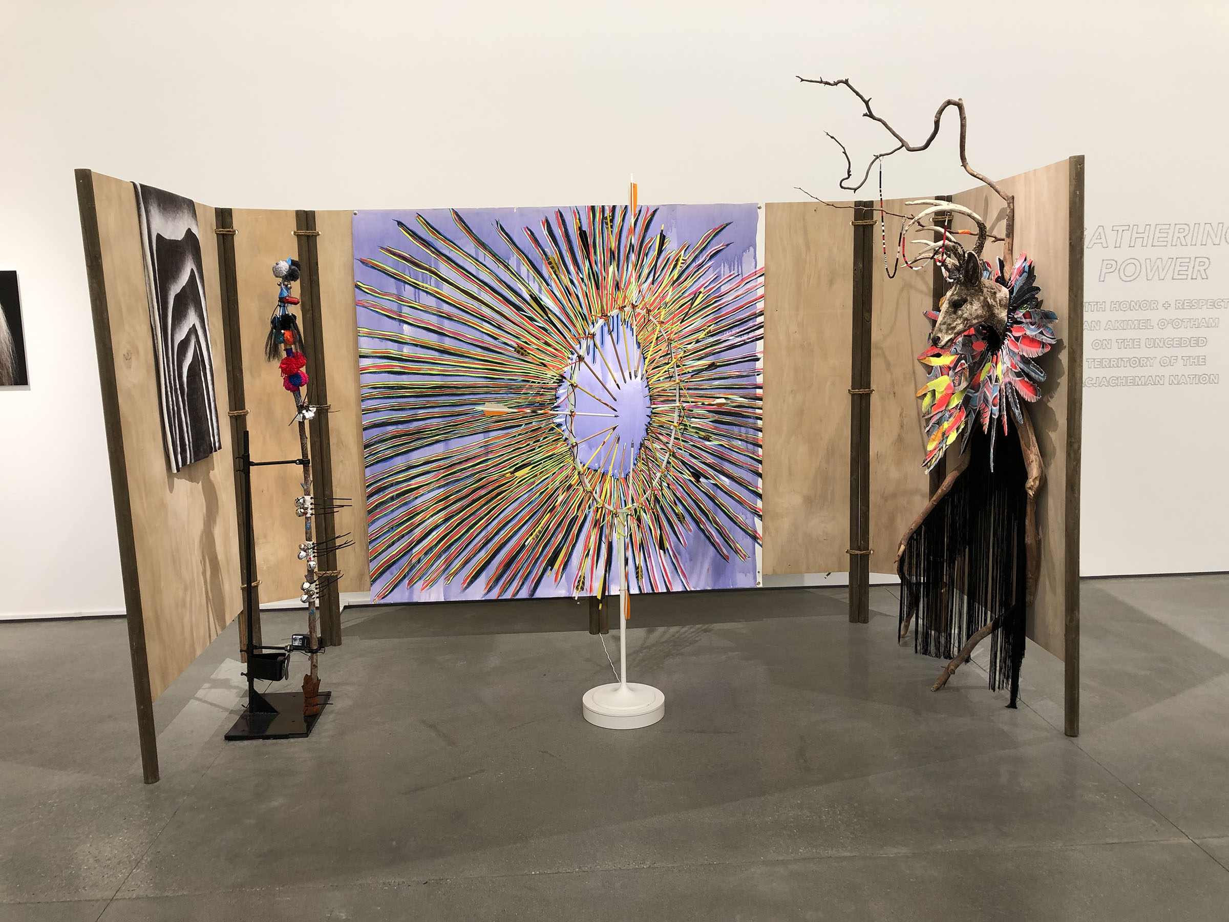 |
| Laurie Steelink, GATHERING POWER (Indian Market Booth), 2022 |
Laurie Steelink's "dream catcher" is a cartoon ring of incoming arrows, rotating to create an op art shimmer.
 |
| Raul Guerrero, Naufragios, 2022 |
 |
| Lily Stockman, Compass, 2022 |
Another theme is resurgent, trippy abstraction, including this Lily Stockman, Compass, 2022. There's a whole wall of Sharon Ellis' mystic dreamscapes.
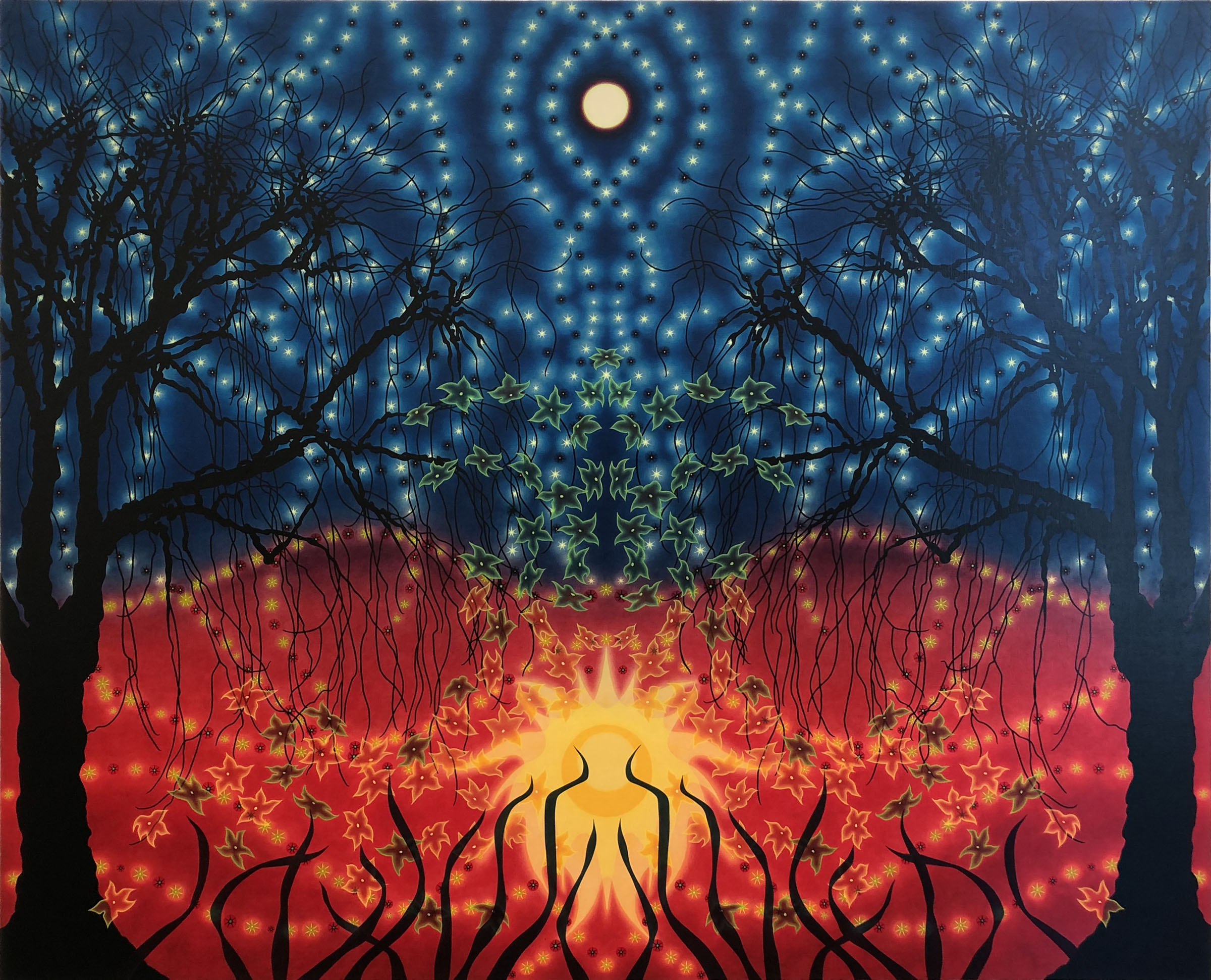 |
| Sharon Ellis, Beltane, 2014 |
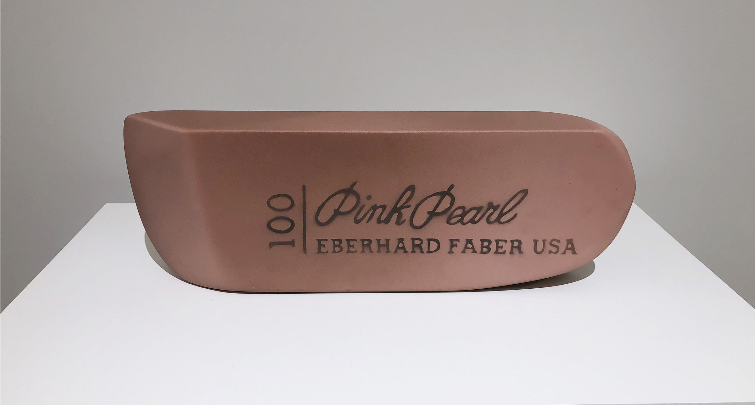 |
| Vija Celmins, Eraser, 1967 |
Vija Celmins is one of the "13 Women." The installation honors the museum's 13 women founders and 13 women artists important to the collection.
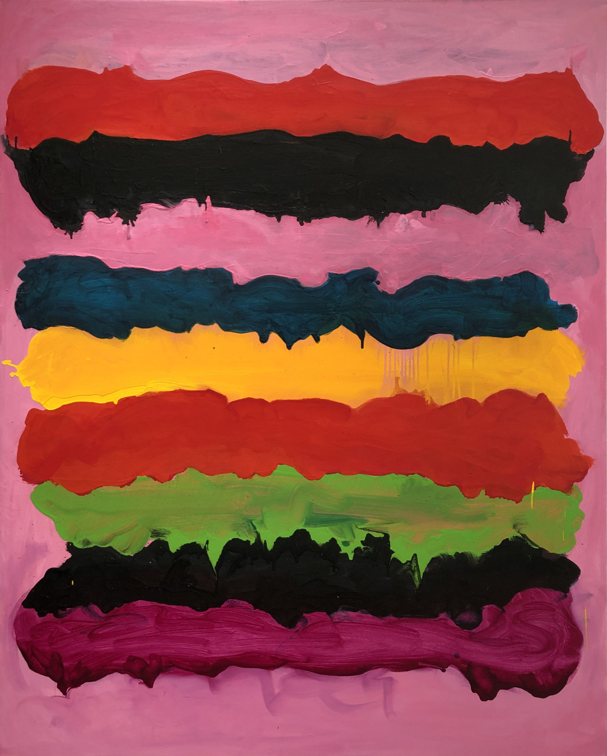 |
| Mary Heilmann, Surfing on Acid, 2005 |
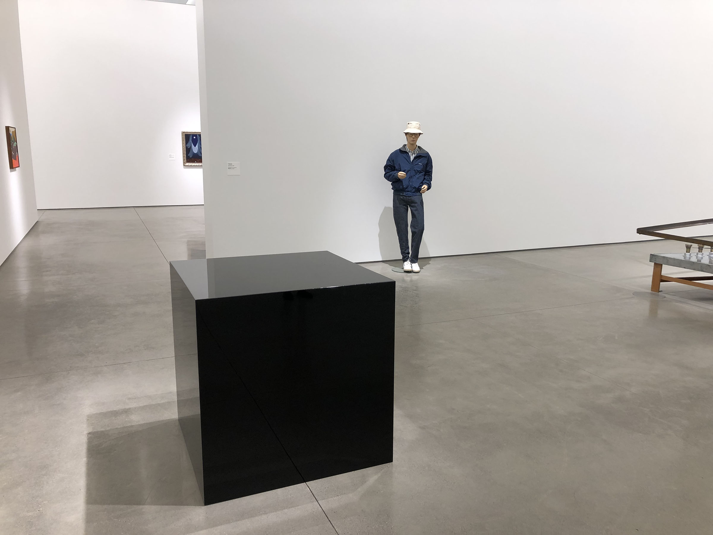 |
| Charles Ray's Ink Box, 1986, and Self-Portrait, 1990 (included in "13 Women") |
"13 Women" has dudes. There's a Diebenkorn Ocean Park, a Ruscha Annie, etc. The show is best described as a woman-forward collection install that won't disappoint those looking for familiar favorites. The selection will change over the installation's run (through Aug. 20, 2023).
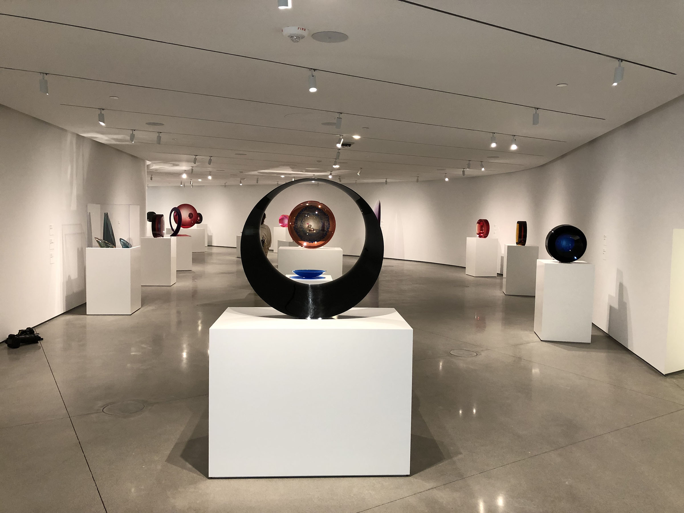 |
| Installation view of "Fred Eversley: Reflecting Back (the World) |
A (fittingly) curved mezzanine gallery holds "Fred Eversley: Reflecting Back (the World)." It catches up with the NASA-consulting engineer-turned Light and Space artist (the movement's only prominent Black), who had a 1976 show with OCMA's predecessor institution, the Newport Harbor Art Museum.
 |
| untitled works by Fred Eversley |
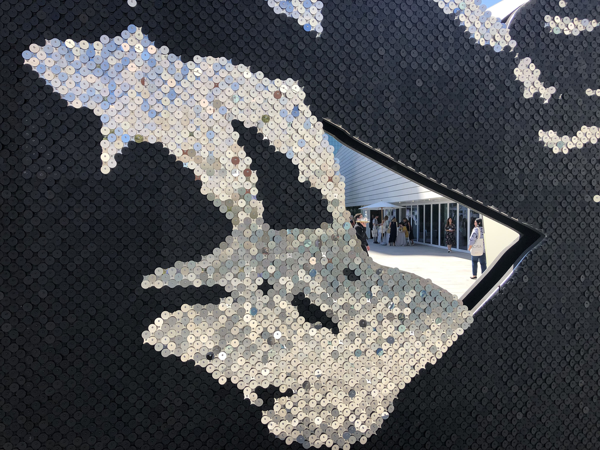 |
| Detail of Sanford Biggers' Of many rivers…, 2022 |
The top floor is an indoor/outdoor space opening onto a 10,000+ sf plaza. The Sanford Biggers commission, Of many rivers…, is completely different from what I imagined from the renders. The reclining, sequined river god with African masks is flat like a billboard or Hollywood facade. The recto has dazzle camouflage and a bench you're welcome to use.
 |
| Sanford Biggers, Of many rivers…, 2022 |
The museum opens Saturday, Oct. 8, at 5PM and remains open a full 24 hours for an inaugural celebration. Admission is free, and no reservations are required.
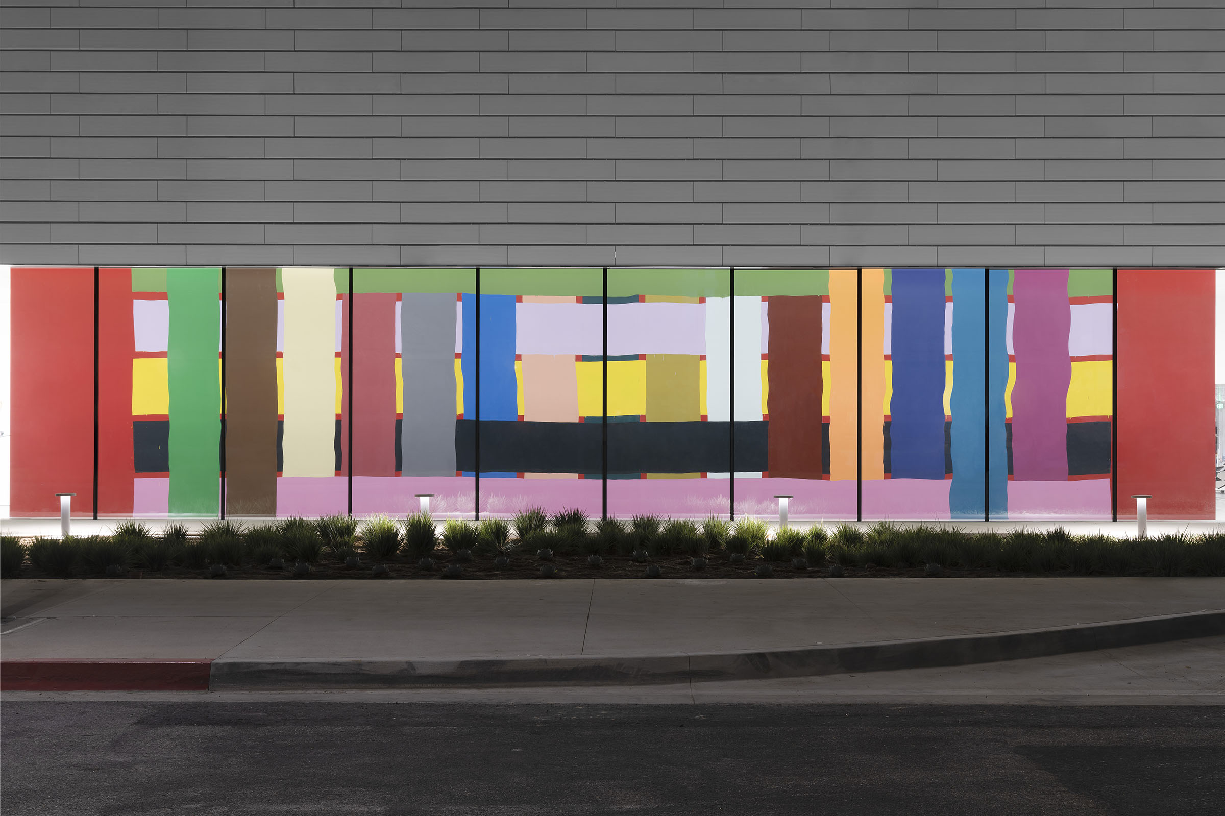 |
| Alicia McCarthy, Untitled (20), 2022. Photo: ofstudio. McCarthy's mural, part of the California Biennial, is visible from Avenue of the Arts |


Comments
... In that picture above, is the bottom edge of that wall finished?
... It appears Mayne was given the same problem to solve as Isozaki at MOCA? How to create an architectural presence for a building that is largely hidden or nondescript. I think Isozaki came up with the better solution.
The saving grace is that MOCA, the Broad and the OCMA are free, while the Louvre is a relatively modest $17, with a generous waiver for people under a certain age well past their teens.
LA's museums - the larger Natural History being the exception, but particularly true for MOCA Grand and the Hammer - would be more satisfactory if they had more exhibit space. If MOCA Grand and its Geffen were one building instead of split, that would come off as more substantial.
However, even the museums of Paris, including its Pompidou and d'Orsay, didn't enter the scene until relatively recently, meaning the past 40-plus years. In the bigger picture (Paris is centuries old), that's but a blink of the eye. NYC's Whitney, as another example, was quite small until just 7 years ago---although its Breuer building still had a bit more space than MOCA Grand has.
Limited space is actually a good thing. It is conducive to judgement and selection. After all, museums should offer an intellectual/aesthetic experience, not one akin to shopping at a flea market.
At the last expansion of the Newport Beach building, they said 'now we've finally got enough space to show the permanent collection and temporary shows at the same time.' Now they're saying that again, with twice the space.
The opposite extreme of that are museums like the Louvre. But for other cultural entities, such as MOCA, there's a lingering reaction of "is that all there is?" That probably doesn't help increase attendance numbers. The "ho-hum" response is even greater when a museum already charges visitors fairly high entrance fees.
When a donor to MOCA gave a donation that now allows for free entry, the feeling of "this isn't worth it!" was lowered. A response made even worse in 2015 when the Broad, with its free admission, opened across Grand Ave.
At least a quarter million objects are NOT on display at the Louvre (Paris). In 2021, the Louvre opened up a storage facility in Northern France for those objects.
The facility is accessible to scholars and conservators. It's not clear if the Louvre will make the space accessible to tourists. It's set up as a storage facility, not a museum.