New Zumthor Renderings
Peter Zumthor's studio has released a new set of renderings for LACMA's David Geffen Galleries. Steven Sharp, in Urbanize Los Angeles, has a slideshow.
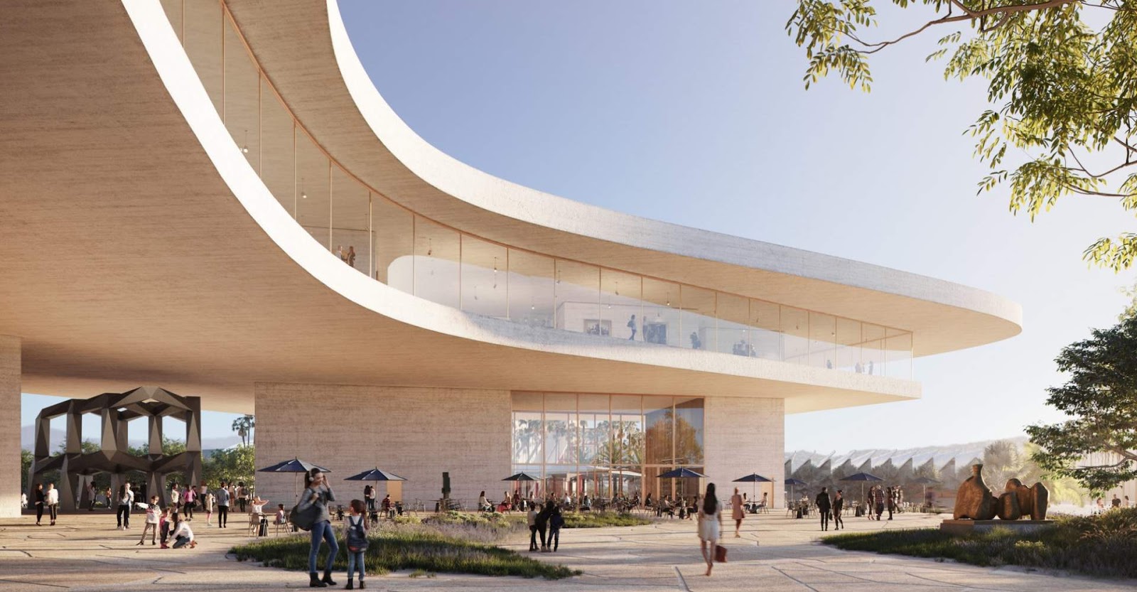
At top, Tony Smith's Smoke huddles under Zumthor's concrete ceiling. Don't take that too literally. The Environmental Impact Report says the underside of Zumthor's building is 23 feet high at the Wilshire overpass. Smoke is 24 feet high.
 As in all previous designs, the gallery floor is sandwiched between concrete slabs. Now the top slab is distinctly thicker than the bottom one and also curvier. The bottom slab has some angles and is slash-like, while the top slab is blobby and biomorphic. A jetliner-view render shows that the blobby aspect will predominate from above.

The glass windows appear to follow the bottom slab. They have angles but are elsewhere gently curved(?) If curtains are still being considered, they're not evident.

Art installations shown in architectural renderings of museums are about as realistic as, well, the people in them. The new interior renderings are handsome but art-sparse and don't do much to address concerns about having enough space for the West Coast's pre-eminent collection of world art. To my best of my knowledge we still haven't seen a gallery rendering that isn't flooded with sideways So. Cal. light. It's unclear how they'd show Indian miniatures or Andean tunics in this building, or if they intend to.
(Architects love light, conservation scientists hate it. The glory of Renzo Piano's Resnick Pavilion is its overhead light. There were a few early exhibitions that took advantage of it. Now the skylights are perpetually blacked out, for almost any large, multimedia exhibition has some light-sensitive works.)
Comments
Every aspect of his plan, from the museum's budget to its layout, from its format (merged departments) to its design (frivolous large windows, smaller theater, less floor space, no conservation space), yell "Disaster!"
Hey, Govan, doesn't retirement to the south of France seem alluring at this time? How about a permanent sabbatical to explore art and artists throughout the world?
It makes me think about extending the park on the other side of Wilshire