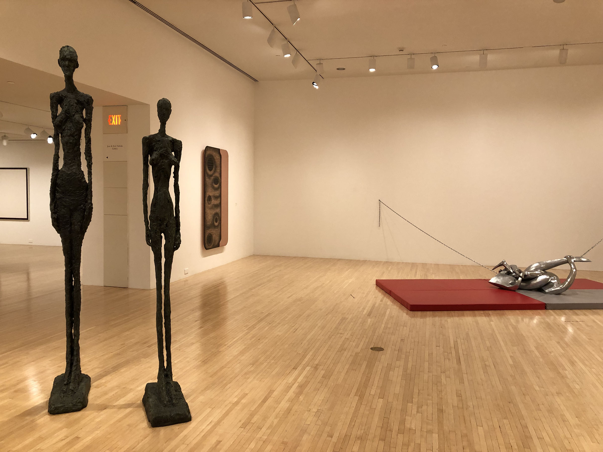
MOCA's "Old and New Dreams: Recent Acquisitions in a Collection" (at Grand Avenue through Sep. 11, 2022) features a selection of the 246 works acquired in the past two years. Unlike a typical new acquisitions show, it mixes the new arrivals with works long in the collection. Thus Camille Henrot's Lobster, which alludes to Giacometti's Woman with Her Throat Cut, is shown near the Swiss artist's two 1960 Tall Figures. These sculptures dominate the first gallery, devoted to figuration in all media. Three other rooms focus on the less predictable themes of self-taught art and geometric abstraction; artificial intelligence; and the occult in So. Cal. art.
 |
| Camille Henrot, Lobster, 2017. Museum of Contemporary Art |
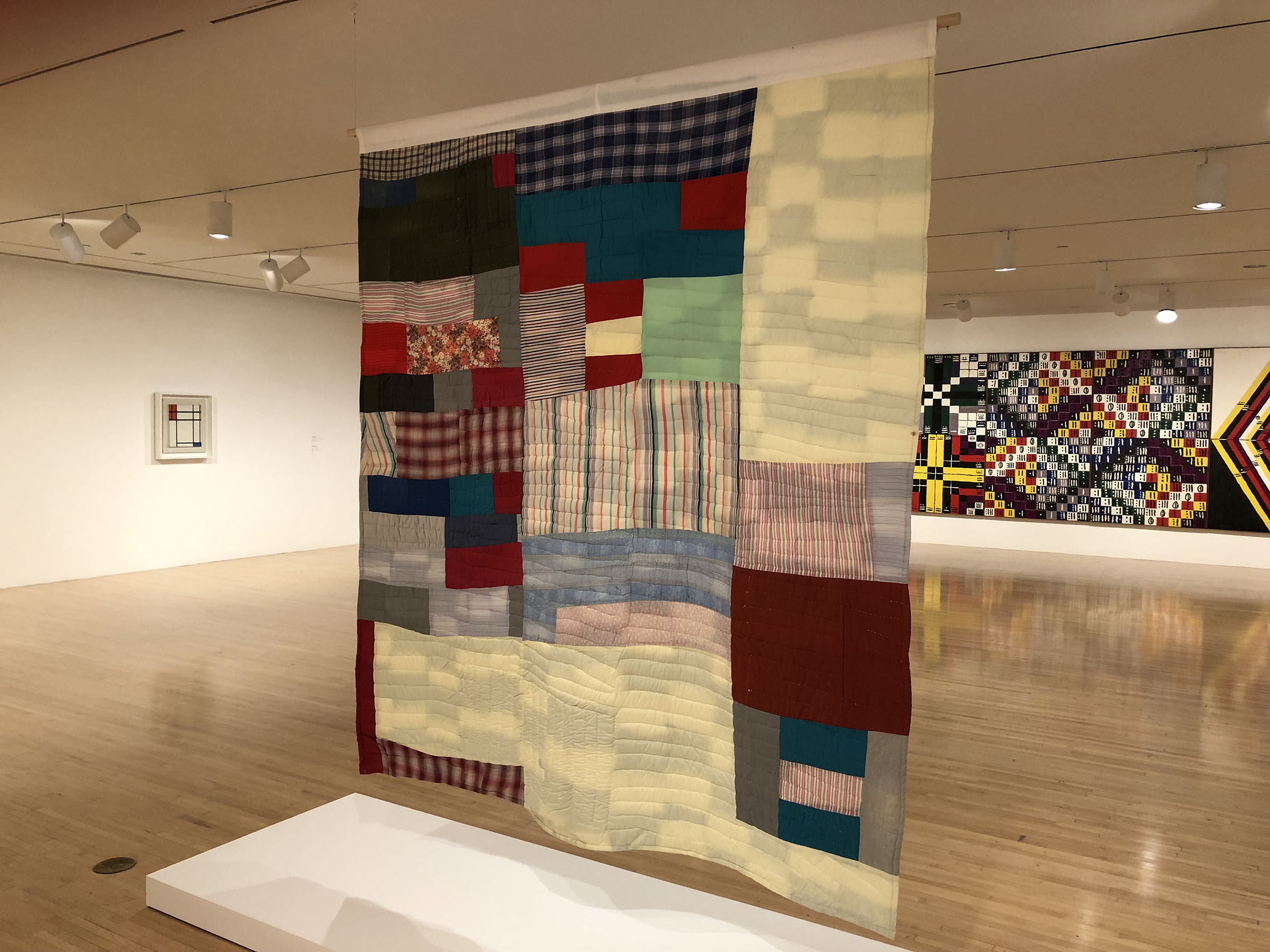 |
| Essie Bendolph Pettway, Two-Sided Quilt: Blocks and "One Patch"—Stacked Squares and Rectangle Variation, 1973 |
Folk and vernacular art have not heretofore been associated with MOCA. Evidently that's changing. On view are a number of recently acquired works by self-taught artists, mostly Southern and Black: Thornton Dial, Walter Price, Mose Tolliver, and Purvis Young. The gallery's centerpiece is a Two-Sided Quilt by Gee's Bend artist Essie Bendolph Pettway, hung so that both sides are visible. It's shown in the context of geometric abstract paintings by Piet Mondrian and Alfred Jensen.
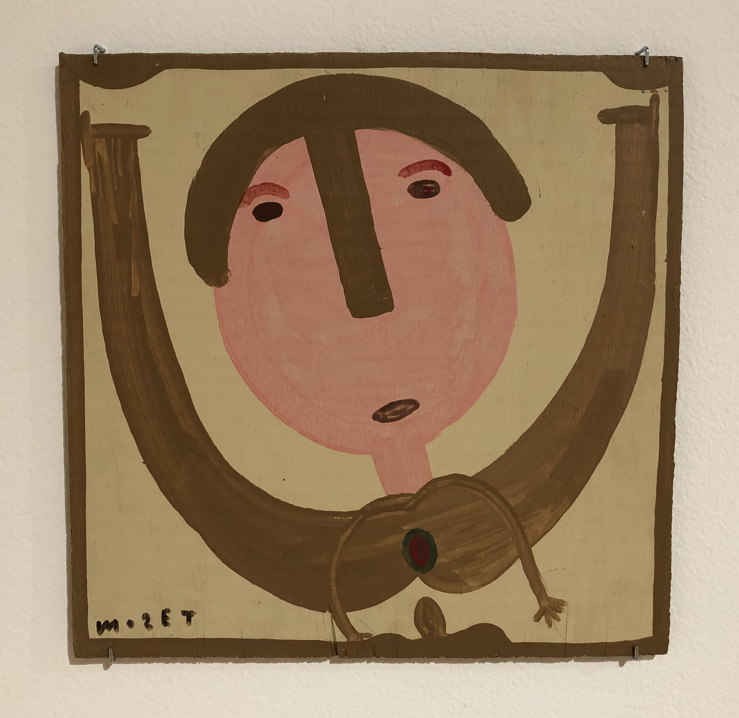 |
| Mose Tolliver, Moose Lady Riding an Exercise Bike, about 1989-1993 |
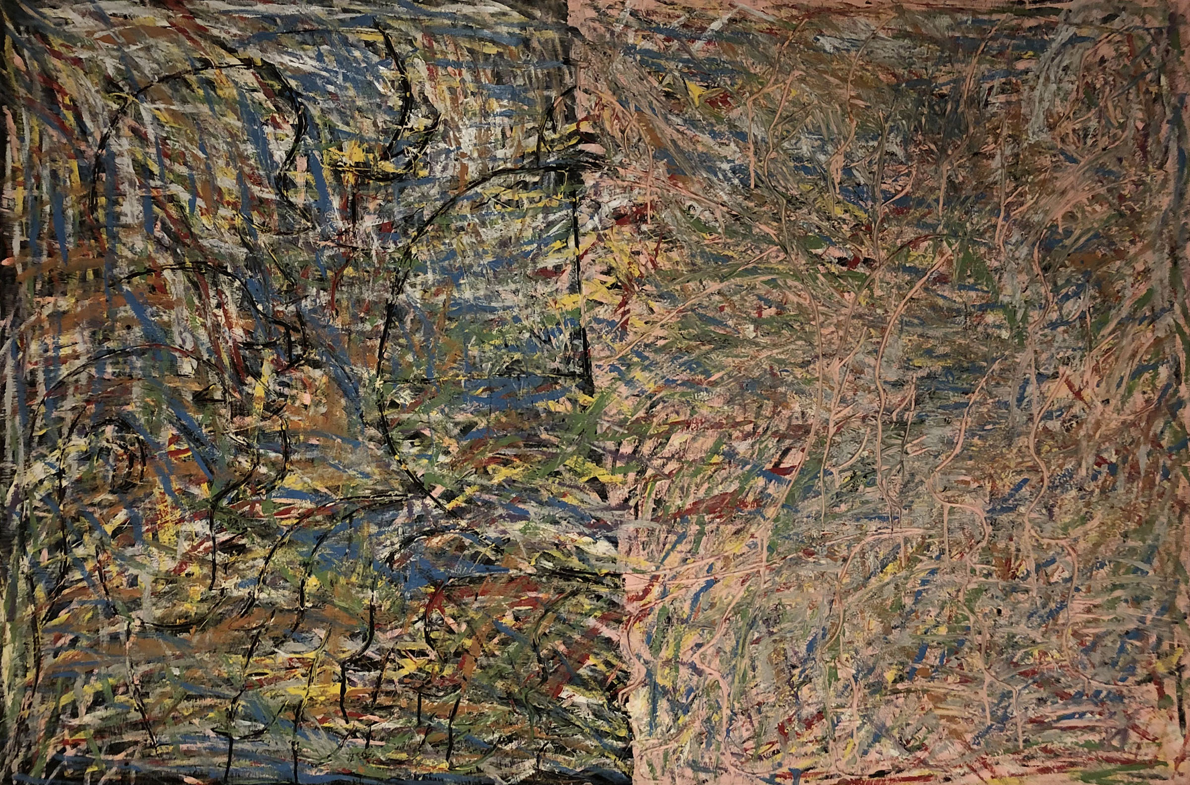 |
| Thornton Dial, Untitled (Time Clock), 1988 |
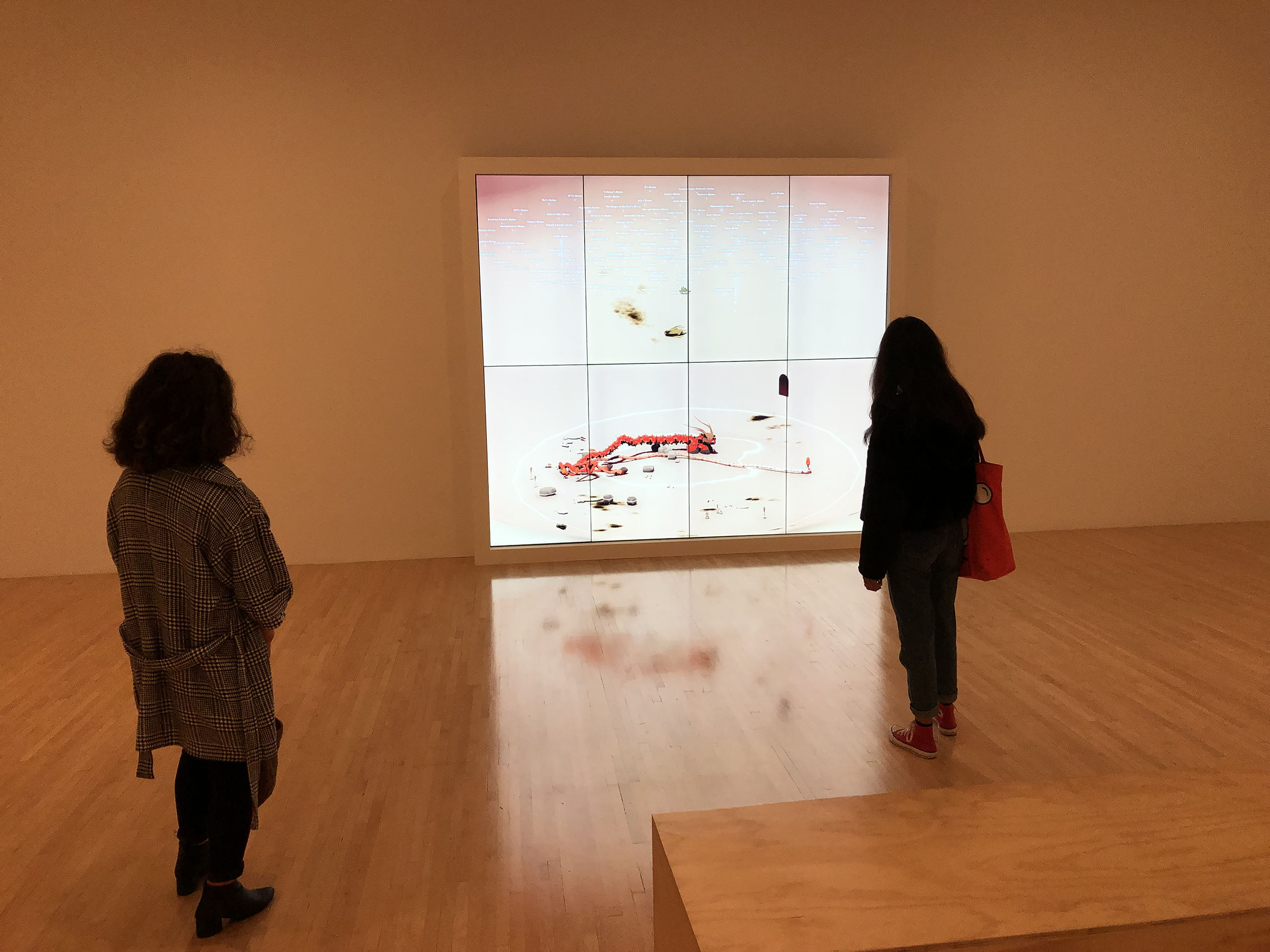 |
| Ian Cheng, BOB (Bag of Beliefs), 2018-2019 |
By number of pieces, the AI theme is the slightest. A room pairs Ian Cheng's BOB (Bag of Beliefs) and David Smith's Cubi III (1961), a mid-century abstraction that can arguably be read as a human figure or robot. BOB is a sim creature rendered interactive via an app. The creature periodically strikes upward at a text cloud, causing a cartoon hole to open in the sky. Tokens of various kinds (mushrooms, cubes, coronaviruses) fall out of the hole until it closes up. The creature sweeps up/eats the tokens until they're gone. Cheng has created a universe, not unlike our own, of meaningless gestures repeated endlessly.
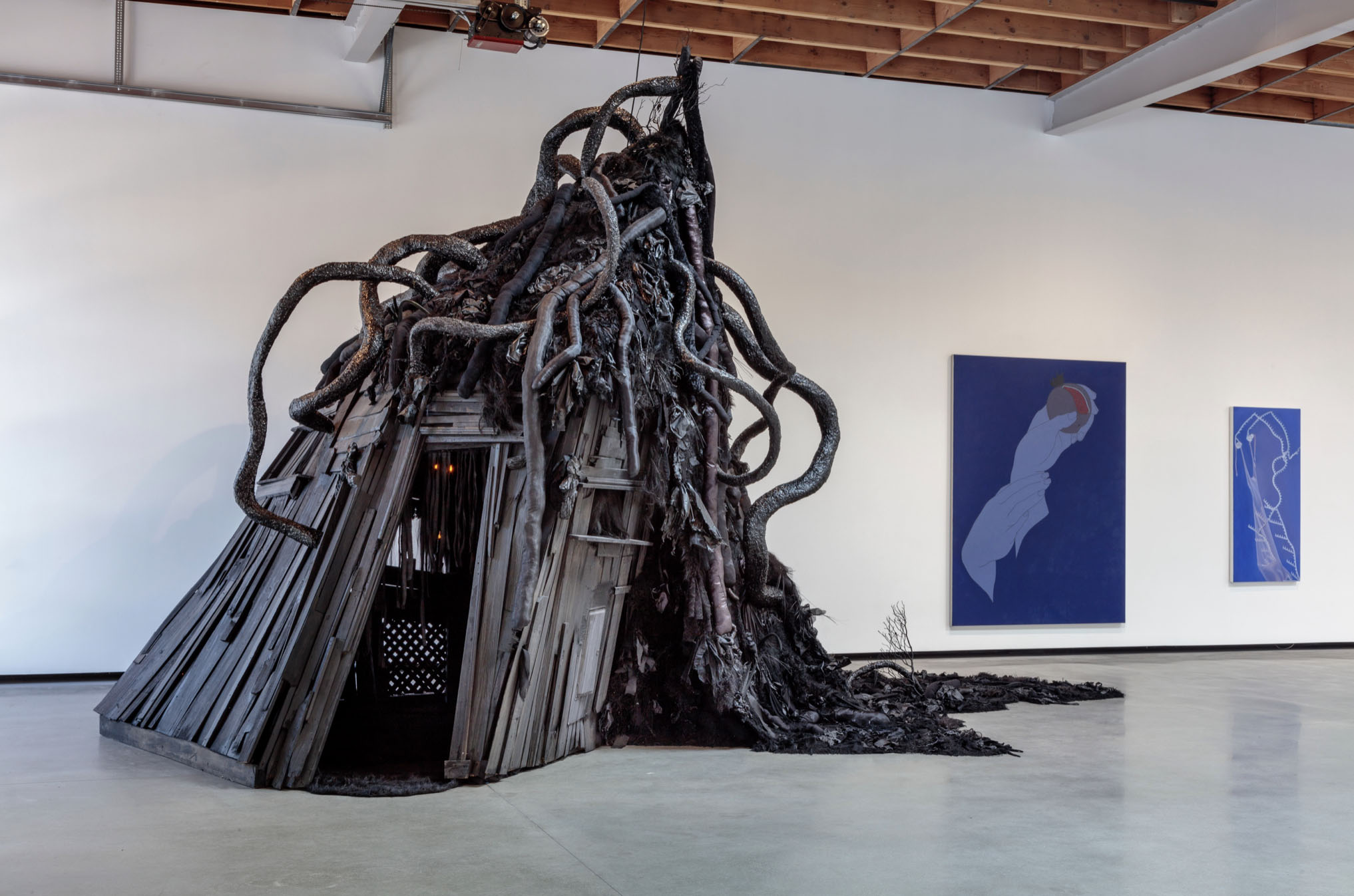 |
| Trulee Hall, Witch House (Seance of the Umbilical Coven), 2020 |
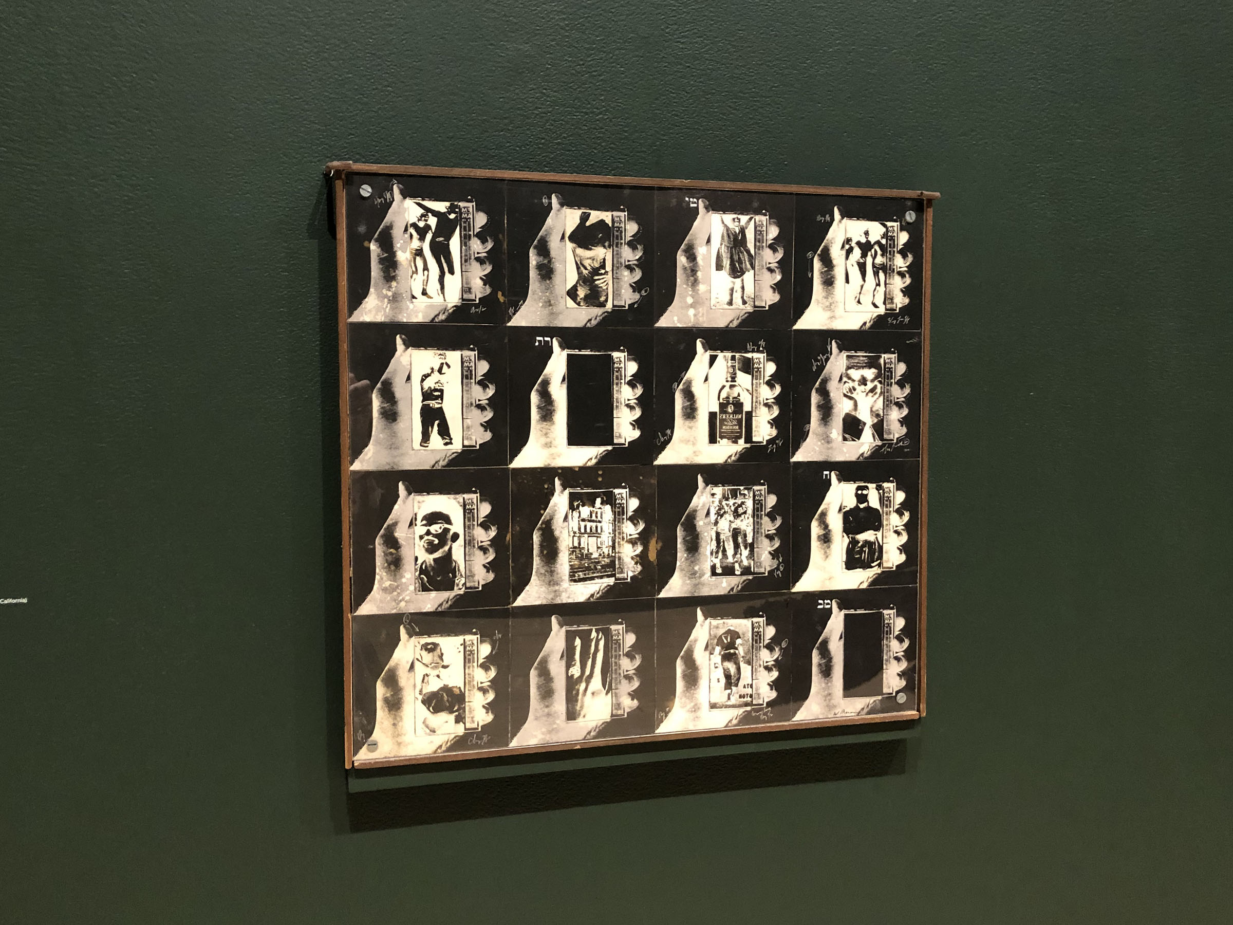 |
| Wallace Berman, Silent Series #14, 1968 |
Trulee Hall's Witch House anchors the occult room, painted a bilious green-black. It's joined by a small, weird, feminist action painting by Cameron, titled Witches Sabbath 2 (about 1950). Another wall holds a cabalistic conclave of Wallace Berman's Verifax collages. It's joined by a Xerox collage of an Atomic Karen (2021) by 2020 Mohn Award winner Kandis Williams.
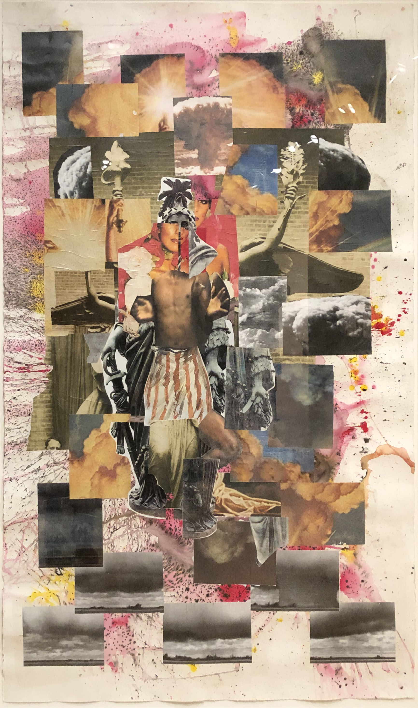 |
| Kandis Williams, Atomic Karen, 2021 |
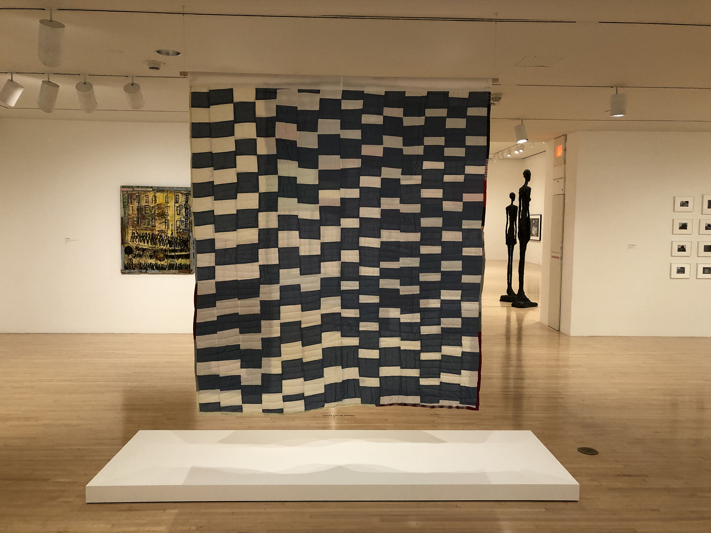 |
| Verso of Pettway's Two-Sided Quilt. At left is Purvis Young's Untitled (City Street with Buildings and People), probably 1970s |


Comments
Judging and determining the skills and quality of artworks are difficult when everything is being filtered through personal tastes and politics.
What's going on at MOCA is also influenced by its galleries on Grand Ave being rather modest in size. So what is on display is hardly prone to triggering museum fatigue. Or the reaction of, "too much, too much."
That's okay if the floor space and expanse of wall surface in a museum are huge. But MOCA isn't.
Same thing is going to be a major problem for LACMA too. Except there, the lack of enough floor space is worsened because instead of walls there will be a lot of floor-to-ceiling windows.
Major-league museums are known to have well over half a million square feet of space. By contrast, MOCA on Grand Ave has only around 24,000 sf and the Geffen in Little Tokyo has 40,000 sf.
I have the same problem with shows at commercial galleries, but with those I can at least take solace in the fact that they are NOT museum shows.