Renzo Piano had one request for the media gathered at Tuesday's preview of the Academy Museum of Motion Pictures: "Don't call it the 'Death Star." He floated, as alternate nicknames for the museum's David Geffen Theater, the Dirigible, the Zeppelin, or the Soap Bubble.
(Not going to happen.)
 |
| Academy Museum of Motion Pictures. Photo (c) Iwan Baan Studios |
Some first reactions to the new museum:
It's big: about 50,000 sf of gallery space in a seven-floor, 300,000 sf complex. That's comparable to New York's Whitney Museum (also a Piano building). Museums usually expand over decades. This is zero to hero. Tom Hanks guesstimated it would take three and half days to see every object and read every label. The temporary show "Hayao Miyazaki" could fill a realistic museum visit for fanboys/girls.
 |
| Installation view, "Hayao Miyazaki" |
 |
| David Geffen Theater. (c) Iwan Baan Studios |
Soap Bubble? The spherical shape of the David Geffen Theater drew skepticism (as in, the sphere is the least efficient use of space mathematically possible). Inside, the theater doesn't feel odd. The radius of curvature is so large that you're not that aware of being in a sphere. My main reaction was, that's a lot of red.
 |
| Oscar Micheaux installation |
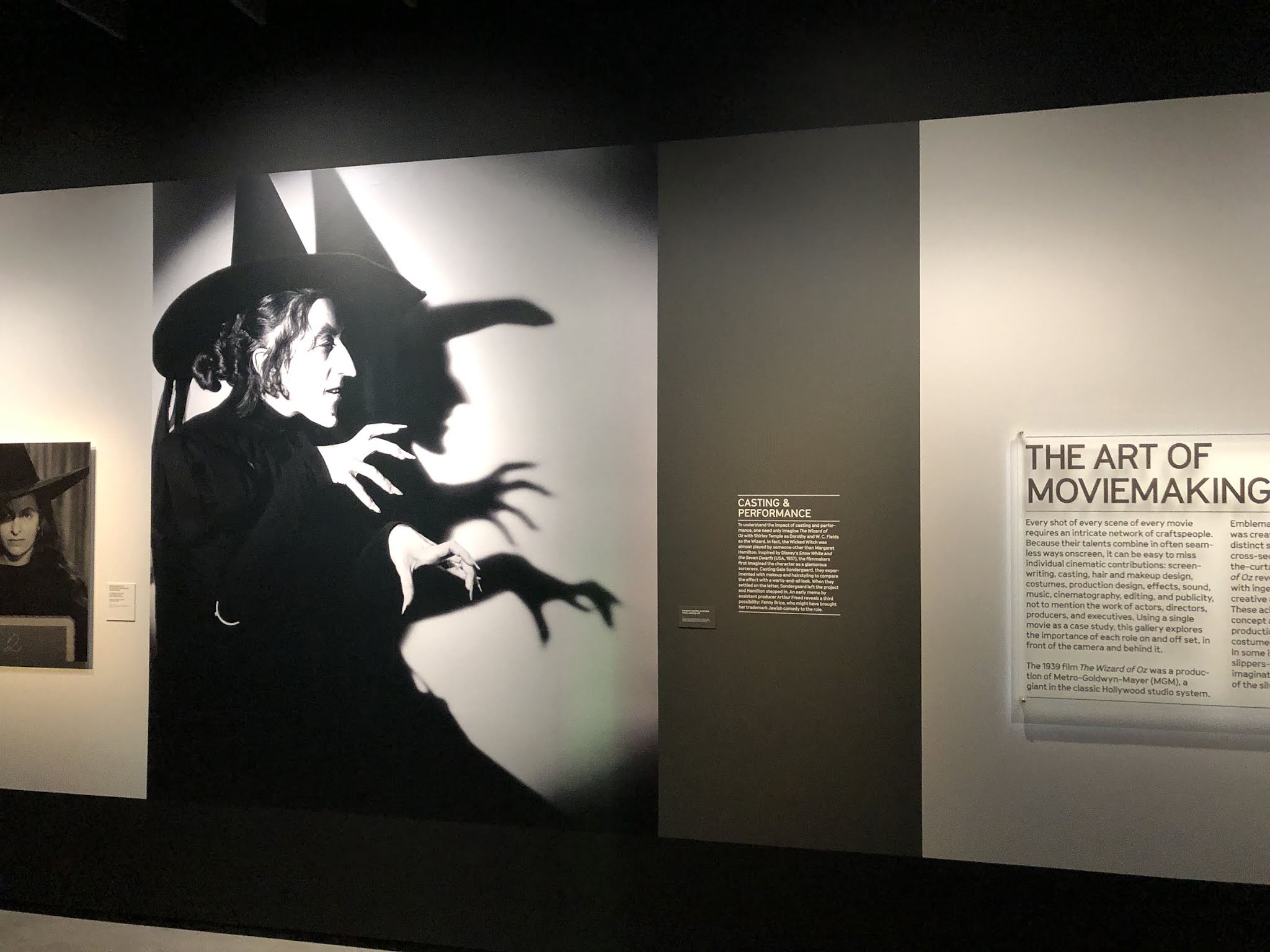
Atoning for Sins. The museum has vowed to not whitewash film history and to tell untold stories. There's a whole room devoted to pioneering Black filmmaker Oscar Micheaux, and another to Real Women Have Curves. A more predictable gallery on The Wizard of Oz finds space for a text panel acknowledging Louis B. Mayer and MGM's exploitation of Judy Garland. It's appropriate, and the wording could be stronger than it is.
Sometimes the museum feels the need to apologize for the history it's not whitewashing. There's a small display on blackface and yellowface (which have become subjects of serious scholarship). A sternly worded trigger warning serves mainly to announce that the Academy doesn't approve. One would hope that goes without saying.
A one-room installation of the Mount Rushmore matte painting used in Alfred Hitchcock's North by Northwest veers off into a tangent on the contested history of the monument, complete with a QR code for listening to a protest song. The history is fascinating and more important than this particular movie prop is. But this is a movie museum, and the small exhibition (titled "Backdrop: An Invisible Art") ends up being off-kilter. A defter touch at integrating movie magic and social justice would be welcome.
A more effective statement on Native Americans v. Hollywood is in the Oscars timeline gallery. A video of Sacheen Littlefeather turning down Marlon Brando's 1973 Best Actor award is performative, transgressive, and playing for keeps.
Another thought: Maybe John Waters should write more of the gallery texts.
 |
| Installation view, "The Path to Cinema: Highlights from the Richard Balzer Collection" |
Film Prehistory. You might be surprised to learn that the collection goes back to the 1600s. "The Path to Cinema: Highlights From the Richard Collection" surveys the world's largest collection of the toys, gimmicks, and inventions that led up to the cinema. The collector's widow, Patricia Bellinger Balzer, donated the objects.
 |
| Kaleidoscope slide, England 19th-century |
 |
| The Lumière brothers' Cinématographe Lumière, the first successful film projector |
Where's history? The core display, "Stories of Cinema," is to be an ever-changing anthology of installations (compare Michael Govan's vision for Zumthor-LACMA). I loved the parts but still felt something was missing.
I get why they're doing it this way. They're banking on the tourist trade. A chronological history of film would begin with B&W silents that no one save scholars has seen or cares about. Box office poison! A reverse chronology would encourage visitors to backtrack to an age-specific zone of nostalgia and then leave. It's necessary to mix up old and new.
Still, there are film historians writing chronological stories of cinema, informed by the latest scholarship and subject to change, as histories always are. You won't get much of a sense of what came after what here.
Except, that is, for the history of the Academy Awards. That merits a timeline!
I was nonetheless pleased that the programming transcends Oscar winners, Hollywood, American film, and the taste for well-crafted expressions of conventional sentiments (exemplified by the Academy Awards).
Random is good. Sometimes, anyway. The lobby level Steven Spielberg Gallery, which will be free, has six screens showing short, random excerpts from 700 movies. It's mesmerizing. The catch is, there's no way of identifying unfamiliar clips that catch your interest.
 |
| Hildur Gudnadóttir installation, 2021 |
Sleeper. Don't miss "Composer: Hildur Gudnadóttir." She scored many an Indie film before winning an Oscar for Joker (2019). Gudnadóttir's installation for the Academy museum is an aural tripscape lighted by glowing sphere that evokes the eye of HAL 9000. It's as refined as a piece at a contemporary art museum. It would great if the museum could commission comparable works from industry pros who aren't necessarily identified as visual artists.
Fine Print. The Academy Museum opens Sep. 30, 2021. Advance online reservations are required, even for those who get in free (members and those under 18). The museum has no parking lot—automotive visitors are referred to the Petersen's or LACMA's lots or street parking (good luck with that). You should try to take public transportation if at all possible, particularly in the first weeks after opening. Bus service on Wilshire and Fairfax is as good as it gets in L.A. There's a ride-share drop-off on the newly christened [Gene] Roddenberry Lane.
 |
| Academy Museum of Motion Pictures. Roddenberry Lane, for ride-share visitors, is at center left. Photo (c) Joshua White |
 |
| Piano's ceilings feature wood-grained concrete and steel columns and visible infrastructure. |
 |
| Benches are hi-tech, too. There are ample views of Piano's Resnick Pavilion at LACMA |
 |
| Under the David Geffen Theater. If you're wondering how shaded it will be under Peter Zumthor's David Geffen Galleries (LACMA), this might be one point of comparison. |
 |
| Fanny's, the museum restaurant |
 |
| Prop from Jaws |
 |
| Spike Lee installation |
 |
| Wall in Spike Lee room showing a hand-painted movie poster from Ghana, taking characteristic liberties with the title |
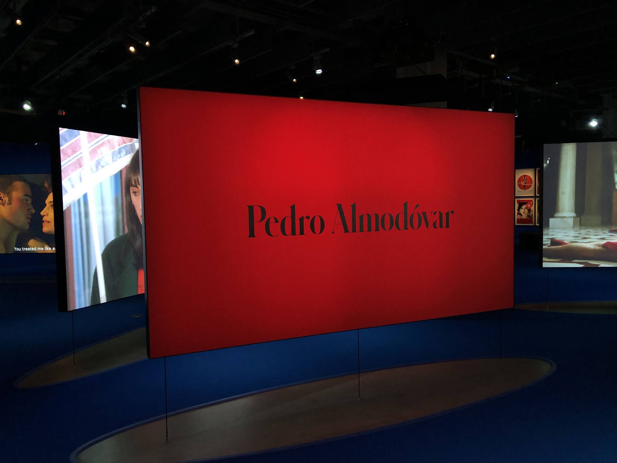 |
Pedro Almodóvar installation. Lee's exhibit is all memorabilia; Almodóvar's is almost all movie clips.
|
 |
| Joseph Stefano typed the screenplay for Psycho on this typewriter. |
 |
| Installation on The Wizard of Oz |
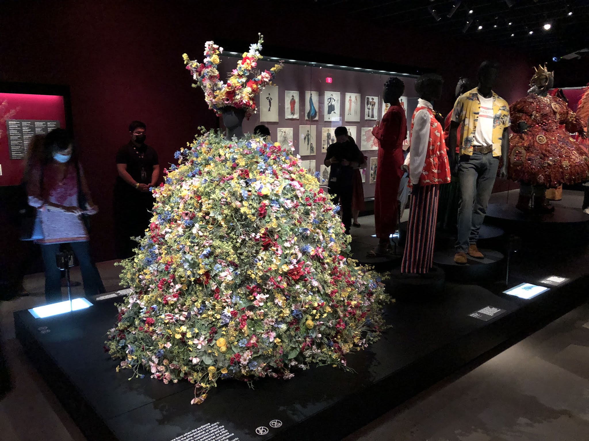 |
| Costume gallery with May Queen dress from Midsommar |
Citizen Kane gallery with Rosebud (a loan from Steven Spielberg)




Comments
https://youtu.be/T3PaqxblOx0