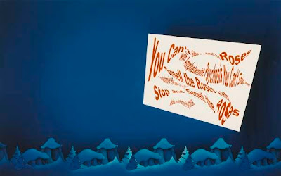
Larry Johnson at the Hammer

The UCLA Hammer Museum's Larry Johnson show opens with a short film, Untitled (Paul Rand's Women, 1948). Johnson is an exponent of L.A. text art, best known for photographs that don't look like photographs, typically referencing Hollywood and hustlers. Paul Rand was a twentieth-century graphic designer, the veritable master of the modern corporate logo. Johnson is hardly known to the public, whereas Rand did logos everyone sees, for ABC, IBM, and UPS. His Enron design has turned out to be more timeless than Enron was. Johnson admires Rand's work, it turns out, and that datum puts an unexpected spin on the Hammer show (curated by Russell Ferguson). Would that all mid-career shows had such a sense of fortuitous nuance.

"The problem of the artist is to defamiliarize the ordinary," Rand wrote. L.A.'s sixties generation did just that, by painting words lifted from signs (or hiring a sign painter to create art). Johnson PhotoShops words and hires someone to create an editioned color photograph. The art crowd loves Johnson to death, it seems. Hammer publicity resorts to that threadbare term, "artist's artist." It just might fit here: This 60-piece show has prints on loan from Richard Prince and Ed Ruscha. Johnson is a curator's artist, too. MOCA has 11 Johnsons, a decent holding for a mid-career guy (at top, Ghost Story for Courtney Love). The Hammer now owns several of the key works in this show.

Most critical attention has focused on Johnson's gayness and on his sources: for the texts, TV Guide, airline black box flight recorders, Frank O'Hara, and so on; for the image, animation cels and found pictures (including commercial logos). For the most part, the Hammer show follows this cue. It also offers an alternative reading: Johnson as the anti-Rand.
Paul Rand's aesthetic economically integrates text and image, as in his classic cover design for Jean-Paul Sartre's The Condemned of Altona. A famous Rand dictum holds that a design should remain recognizable even after being distorted or mutilated (example, Rand's black-and-white cover for Design Quarterly).

Throughout his maturity, Johnson has been going in the opposite direction: text distorted to the point of illegibility. Words are twisted digitally; paragraphs are parti-colored to create shimmering patterns as disorienting as a color blindness test. Johnson's Thinking Man's Judy Garland has those words in white on white. You can barely "read" the photograph, standing in front of it. Rand waterboarded logos to learn which had the right stuff. With Johnson, the torture is the art.

Jasper Johns fanboys debate the source for every little jot and tittle. For Johnson aficionados, the Hammer show outs the source of the tasteful color stripes against white that background some of the distorted-typography pictures. It's lifted directly from Paul Rand's packaging for the first IBM PC's.
Comments