Pop Art Meets Design, and Kitsch, at OCMA
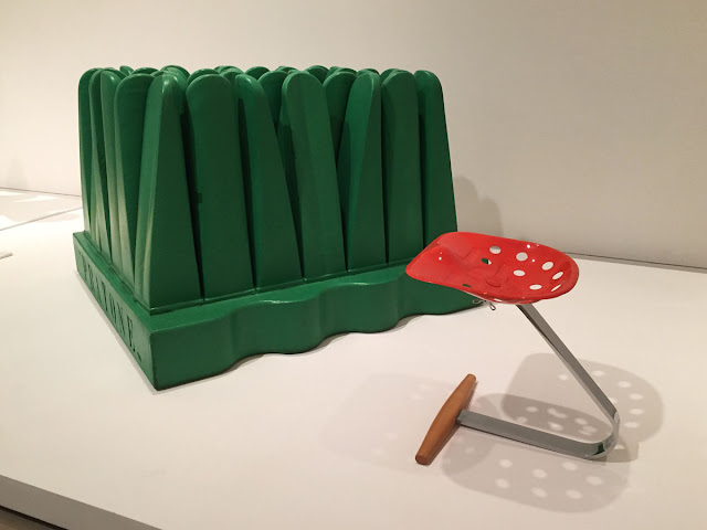
Just what is it that makes today's homes so different, so appealing? You'll find a partial answer to Richard Hamilton's 1956 question in the Orange County Museum of Art's "Pop Art Design." Gruppo Strum's Pratone (1966) and Achille and Pier Castilioni's No. 220/Mezzadro (1954/1971) probe the differences between furniture, sculpture, and kitsch. "Pratone" means "big meadow." It's a large piece of turf, executed in cushy polyurethane foam. The idea was that you'd sink back into it after a hard day. The Castiglioni brothers' stool is an assisted ready-made, a red tractor seat collaged to a wood ladder rung. Both are stunningly unsuited to Netflix and chill.
It is of course a common complaint that high-end modern design is uncomfortable. OCMA mounts some chairs to the wall, as if to emphasize their status as art, not sit-upons.
Where Pop design departs from earlier modernism is in the matter of "taste." Much of it is transgressively bad taste ("camp," as they said in the 60s).
Shown is a curator-imagined c. 1969 suite of chair, mirror, and sofa by Allen Jones, Etore Sottsass, and Studio 65. The sofa is a plush souvenir of Man Ray's 1936 painting of the Griffith Observatory. Stanley Kubrick wanted to use Jones' porno chairs in A Clockwork Orange. He couldn't secure the rights and had to settle for knock-offs.
"Pop Art Design" includes several figures slotted as mid-century. Pieces by Charles and Ray Eames remind us how fluid art-historical categories are. The Eameses had an appreciation of vernacular sources, evident in their private collection of folk art and in relatively disregarded creations such as the House of Cards.
The earliest major object in the show is George Nelson's Sergeant Schultz table lamp of 1947. The shade is a miniature army helmet, familiar to returning vets. Nelson's Sergeant Schultz is not to be confused with a similarly helmeted namesake in the campest WWII prison sitcom of the 1960s, Hogan's Heroes.
"Pop Art Design" hints at a story that deserves to be unpacked more fully: how modernism's Nazis slouched towards Pop and irony.
 |
| Jonathan De Pas, Donato D'Urbino, Paolo Lomazzi, and Carla Scolari. Blow, 1967 |
Where Pop design departs from earlier modernism is in the matter of "taste." Much of it is transgressively bad taste ("camp," as they said in the 60s).
Shown is a curator-imagined c. 1969 suite of chair, mirror, and sofa by Allen Jones, Etore Sottsass, and Studio 65. The sofa is a plush souvenir of Man Ray's 1936 painting of the Griffith Observatory. Stanley Kubrick wanted to use Jones' porno chairs in A Clockwork Orange. He couldn't secure the rights and had to settle for knock-offs.
"Pop Art Design" includes several figures slotted as mid-century. Pieces by Charles and Ray Eames remind us how fluid art-historical categories are. The Eameses had an appreciation of vernacular sources, evident in their private collection of folk art and in relatively disregarded creations such as the House of Cards.
The earliest major object in the show is George Nelson's Sergeant Schultz table lamp of 1947. The shade is a miniature army helmet, familiar to returning vets. Nelson's Sergeant Schultz is not to be confused with a similarly helmeted namesake in the campest WWII prison sitcom of the 1960s, Hogan's Heroes.
"Pop Art Design" hints at a story that deserves to be unpacked more fully: how modernism's Nazis slouched towards Pop and irony.


Comments